Stripping Down #3
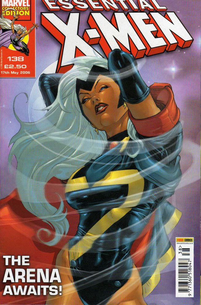 Essential X-Men #138
“The Arena” by Chris Claremont & Igor Kordey
(X-Treme X-Men #38-39)
“Here Comes Tomorrow” by Grant Morrision & Marc Silvestri (New X-Men #151)
Now, Storm’s one of my favourite comic characters but, with “The Arena”, Chris Claremont and Igor Kordey have sorely tested my loyalty. Though I’ve heard bad things about Chuck Austen’s writing on Uncanny X-Men, did it really deserve to be ditched from Panini’s UK newsstand title in favour of the apparently equally dire X-Treme X-Men? At least early issues of this tired, clapped out series benefitted from Salvador Larroca’s gorgeous art. As this issue demonstrates, his covers serve not only as a reminder of what was, but also as a warning of the horror that awaits within. The contrast between artists is immediately apparent and can come as a bit of shock. Larocca’s “Baywatch Storm" is immediately countered by Igor Kordey’s splash page. Here, Storm more closely resembles a character from a David Lynch movie (I’m specifically thinking of Juana, played by Grace Zabriskie in “Wild At Heart” as I write this). I’m still at something of a loss to explain Igor Kordey’s style; there’s very little attention to anatomical detail and characters often look stunted or deformed. There’s also a pervading ugliness that, though a refreshing change from the uniformly gorgeous and statuesque characters often to be found in superhero comics, can be unnecessarily distracting at times. Whereas veteran Richard Corben arguably adopts a similar approach, Kordey’s sense of storytelling and flow is considerably inferior and I find myself returning to a page to make visual sense of it. All of this would be perfectly fine, if I believed that this was truly Kordey’s intention all along. Rather, I’m left thinking that he simply doesn’t grasp the basics of visual narrative and no-one at Marvel has the balls to tell him. If only the story’s concision and clarity acted as a counter to this. Unfortunately, being Chris Claremont, excessive verbiage, exposition, clichés and the weight of continuity (naturally, only stuff that he’s previously written) are the order of the day. I feel slightly hypocritical regarding the latter comment, as I realise that I’ve just typed over three hundred words, without commenting specifically on “The Arena”...! I’ll keep it short and sweet, then. A tedious, overlong, non-event of a serial, Storm fights in an arena. A lot. And likes it. As a character, Storm learns nothing that hasn't been covered in previous storylines (invariably written by Claremont). As a reader, I felt that I was stuck in "Groundhog Day", in the worst sense, as the plot of "The Arena" seemed to go in circles.
If only Claremont had been keeping an eye on fellow US title New X-Men, he might have learnt a thing or two about comics writing in the 21st century. Grant Morrison has breathed new life into the X-universe, with gripping plots, great characterisation and a fresh perspective on characters that were previously considered overbaked. What a shame then, that the series has consistently played second fiddle in Essential X-Men to the inferior Claremont soap opera. Following on from last issue’s deaths of Jean Grey/Phoenix and Magneto, the story leaps forward 150 years to focus on the fate of the future X-Men and the mysterious Phoenix Egg. Morrison’s skill, as always, is to introduce a scenario with an economy that enables readers to empathise with new or substantially changed characters, without interrupting the plot’s flow or padding the storyline out in order to fit a six-issue paperback collection. I immediately engaged with lead character Tom Skylark and his pet Sentinel robot, Rover, even knowing that this storyline may be their first and only appearance. I also found Marc Silvestri’s art a considerable asset and pleasant surprise. I collected Uncanny X-Men in the 1980s, when Silvestri took over from John Romita Jr, and wasn’t overly impressed by either artist's work at the time. In retrospect, I think the common factor was inker Dan Green, whose style failed to bring out the best in Romita’s and particularly Silvestri’s pencil art. I guess the intervening years have also enabled Silvestri to hone and perfect his art. Certainly, Silvestri’s art is an excellent match for Morrison’s writing and I’m looking forward in every sense to subsequent instalments.
So, all in all, Essential X-Men #138 is a bittersweet feast: an appetising cover for starters, with an overcooked main; thankfully a delicious dessert erases all traces of the former. I’m just praying that another double helping of Chris Claremont and Igor Kordey in Essential X-Men #139 doesn’t give me indigestion…
Panini UK comics website

posted by Khayem at 9:58 am
![]()
![]()

2 Comments:
Larocca’s “Baywatch Storm"...
Lol! Classic!
Just to show you that I do actually read you comic articles, even if I have nothing constructive to say about them!
Hell, I'm not even sure I had anything constructive to say about this particular issue!
Post a Comment
<< Home